Cover your assets.

PROJECT DETAILS
As Trophy Insurance Solutions entered a new chapter of their business, they needed to embrace a new identity without tossing out any of the brand equity and recognition they’d already built in their communities.


That’s the golden ticket.
That’s the golden ticket.
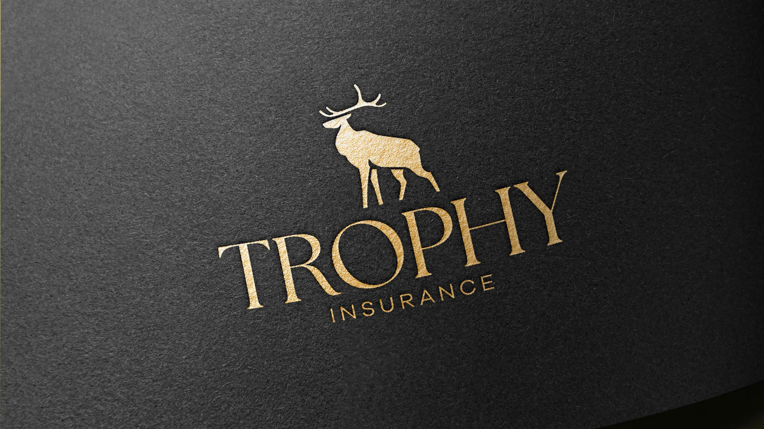
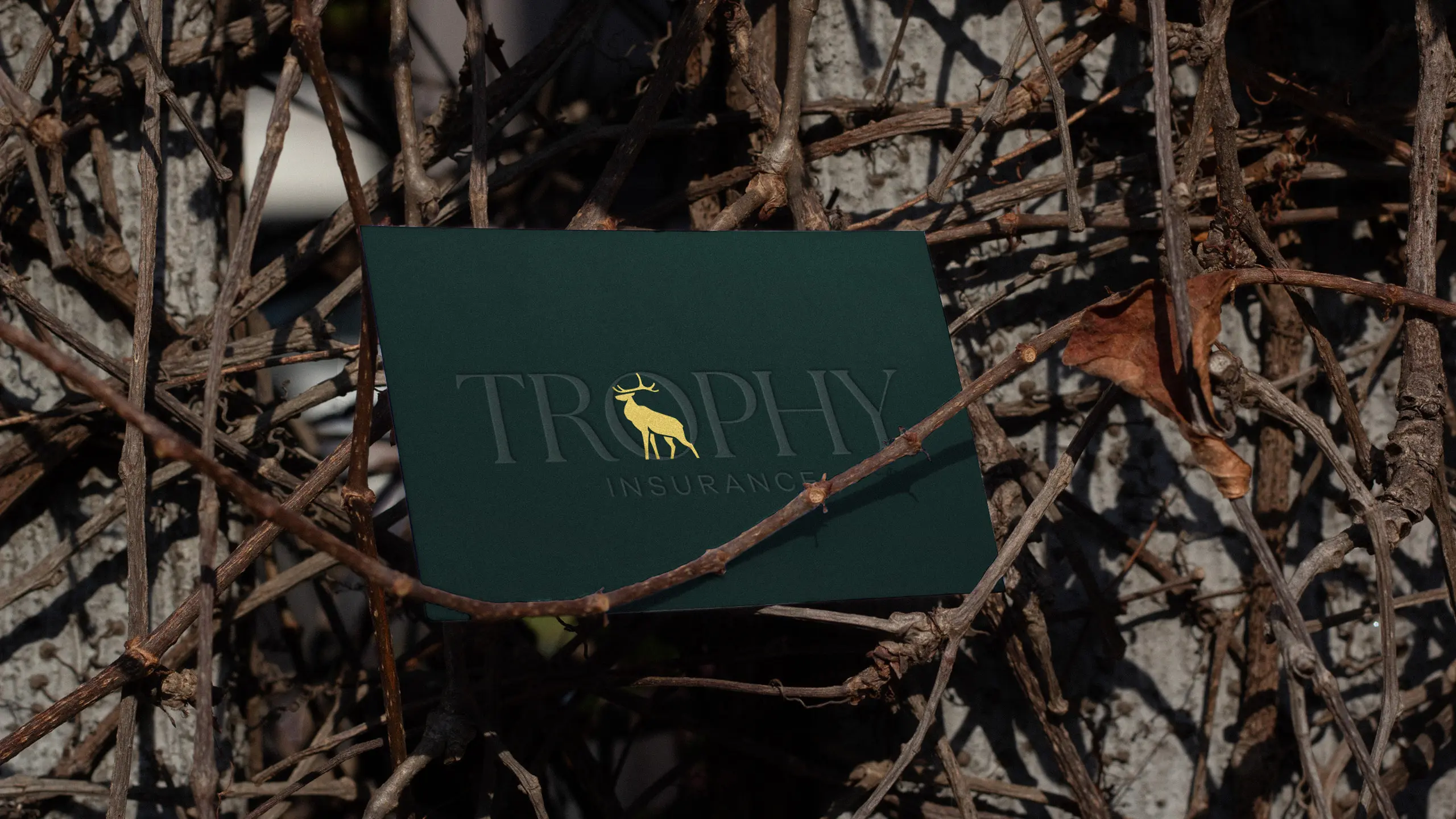
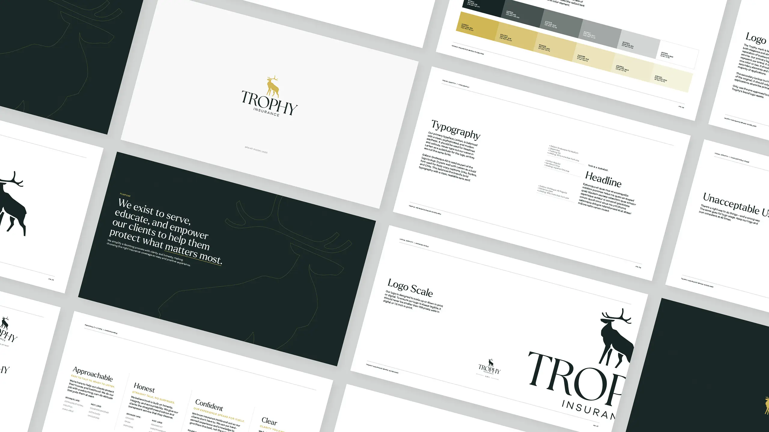
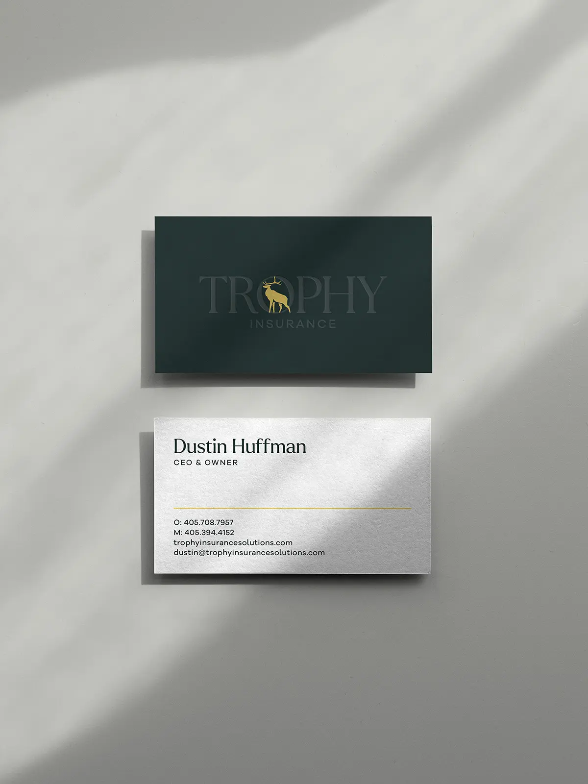
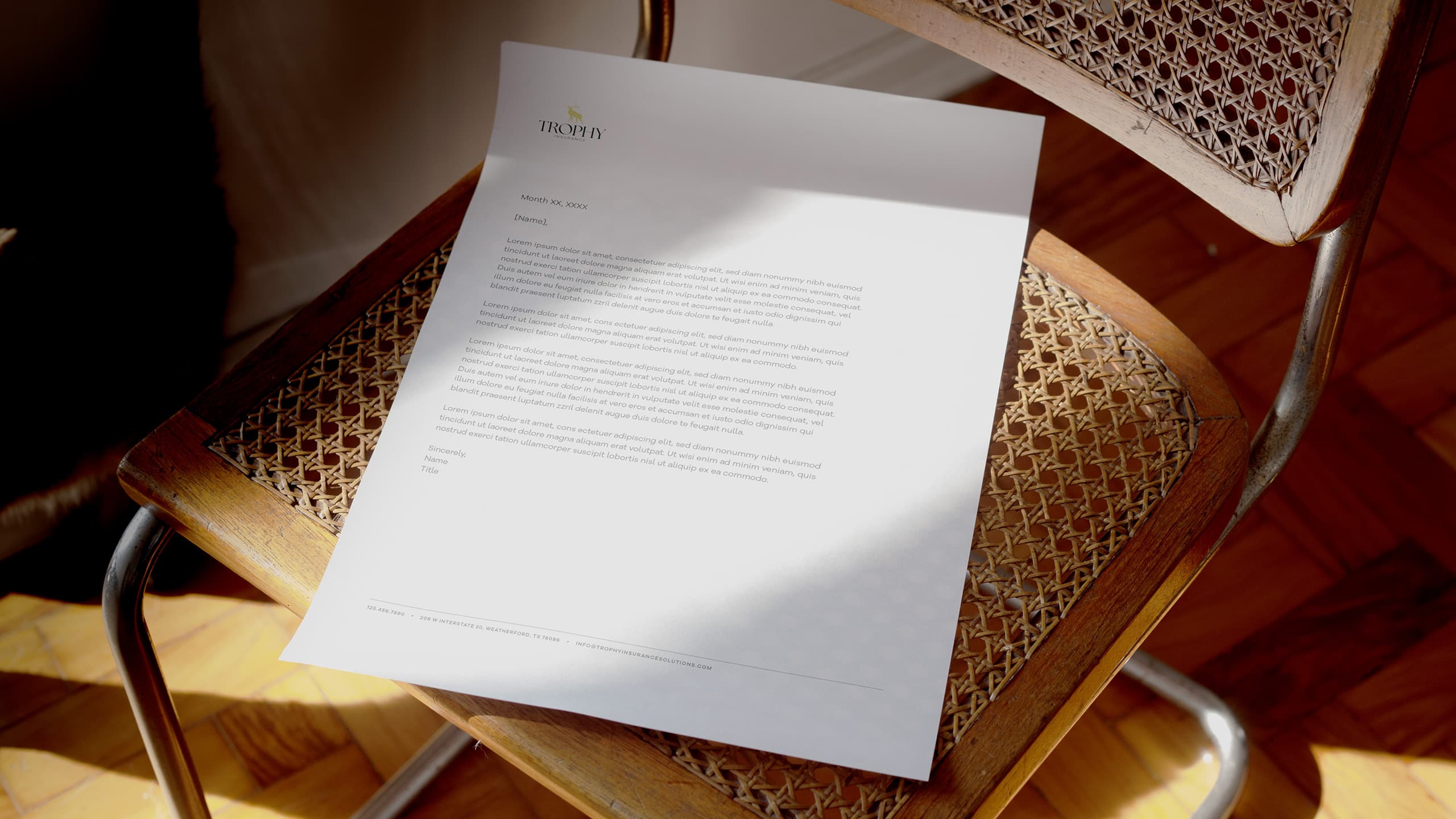
We developed a new visual and verbal identity that elevated the foundation of the brand while preserving the most iconic elements of the original. The buck icon and gold accent color were a must — a giant golden statue of a buck still took permanent residence on their main office’s front lawn, after all.
We paired a balanced, clean set of typefaces with a revamped color palette focused around green and a more sophisticated shade of Trophy’s original gold. We iterated on the updated buck icon to create a background element that could be used in a variety of applications.
Breaking past the preconceptions.
Breaking past the preconceptions.
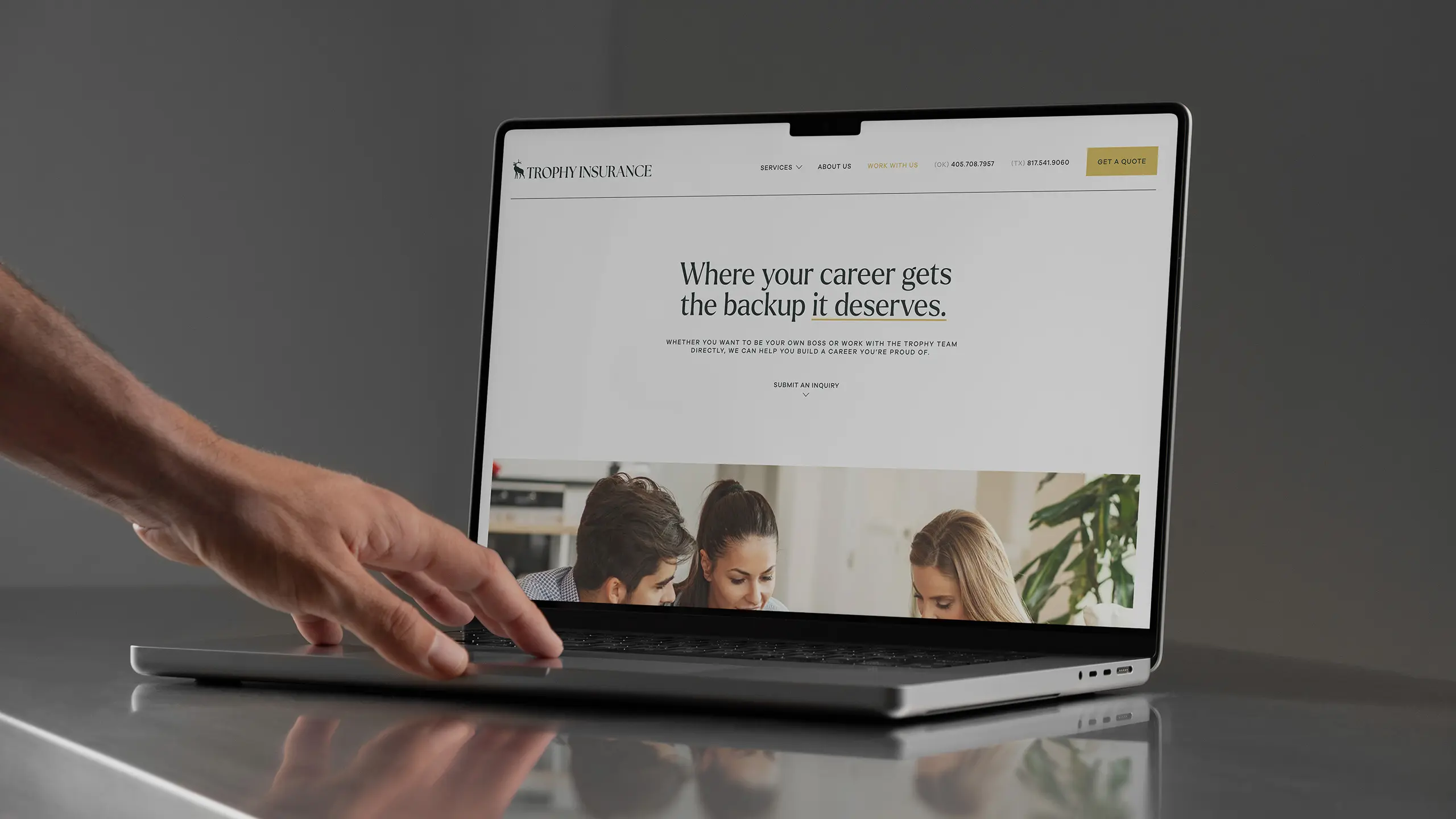
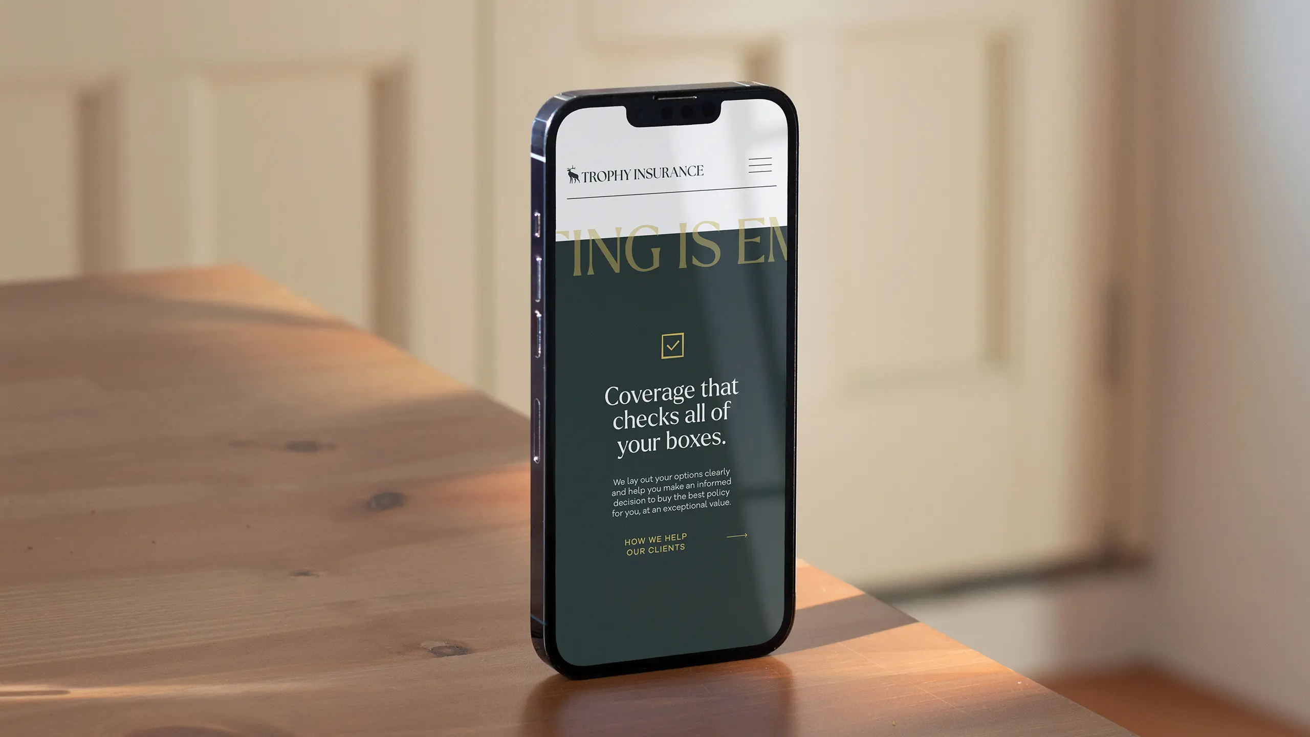
We built Trophy’s website messaging around the pillars of their brand identity; serving, educating, and empowering their clients to protect what matters most. Because much of their audience already has a suspicious attitude towards insurance coverage and sales in general, it was important to reassure site visitors that with Trophy, what they see is what they get: the best service, the best coverage, and the best price.
Results
With a few thoughtful design decisions that updated the overall feel of the brand but kept the elements that really mattered, we helped Trophy kick off a new era of success without losing sight of the company’s legacy.
